Dev Diary #68: Level Design Done, UI Refresh In Progress

Hey friends,
It’s been an unbelievably busy couple of months for the team. Who knew that updating your game’s name and assets on all platforms would be so much work?
Okay, so we knew it was going to be a pain, but still. Updating all our information reminded us of the sheer number of platforms developers need to be on these days. Sheesh. Thankfully, most of the admin is done and we can get back to more updates on development.
Level design is done!
Today, we’re proud to announce that all the environments have been completed for Freeborn. We are now in the process of populating the later environments and implementing the quest structures and associated battles/dialogue scenes. Plus there are still some touch-ups that need to be done for some of our older environments. But we are all done with creating new levels! 🎉
Here’s a quick run-through of the most recent, and final, levels Jesse has created. We’re excited to fill them up and finish the story!
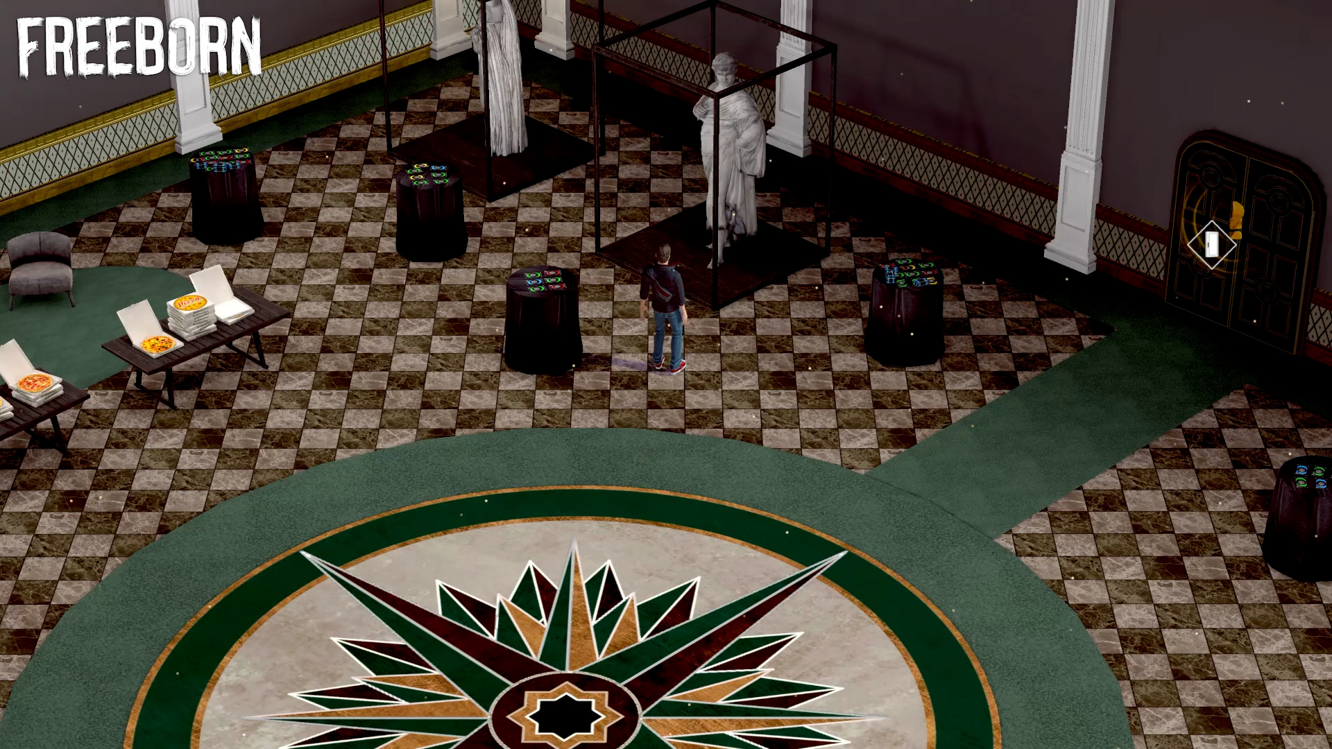
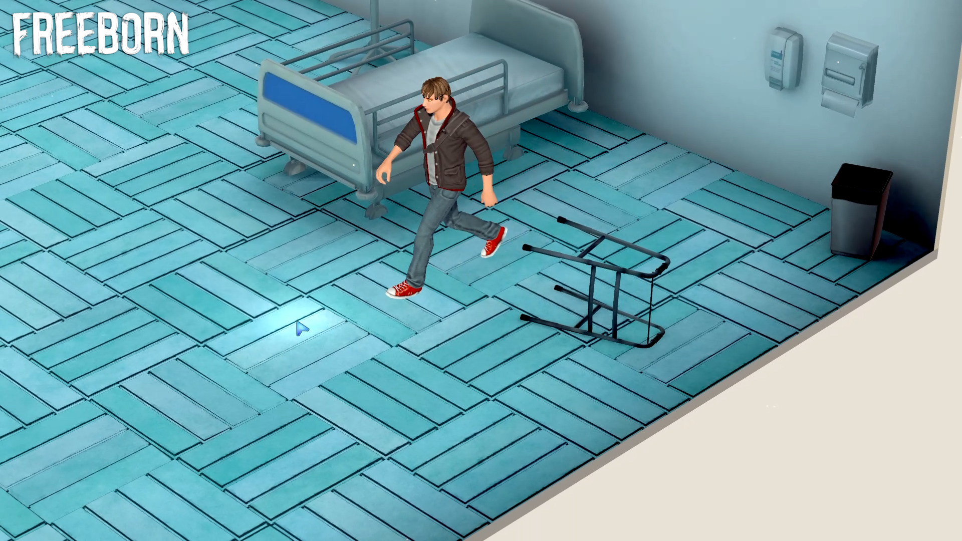


New platforms
As I mentioned before, we’ve been updating our game pages on sites like itch.io and GameJolt, but we are also on some new social platforms like our Instagram. If you use the ‘gram, go ahead and give us a follow! We’ll be posting smaller, more frequent updates there.
Next up: a UI refresh
The relationship between promoting Freeborn and developing Freeborn has been deeply entwined for years. Once upon a time, an editing decision when working on a trailer led to a full overhaul of the dialogue system!
Recently, our promotion has largely been about organic engagement on Reddit, Twitter, and other platforms. We’ve been sharing videos and images of our game, and getting a combination of incredibly kind wishes and very savvy feedback on areas for improvement.
One area that we’ve had in mind for a while is the user interface. In the coming weeks/months, we’re going to do an update of the various UI elements in the game. And there are a lot! From the start menu, to the in-game pause menu, to the mini-map and observation icons, to the Ekosi card match/inventory interfaces, to the dialogue system… Yeah, a lot.
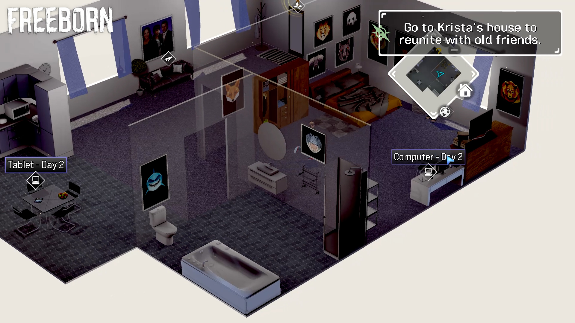
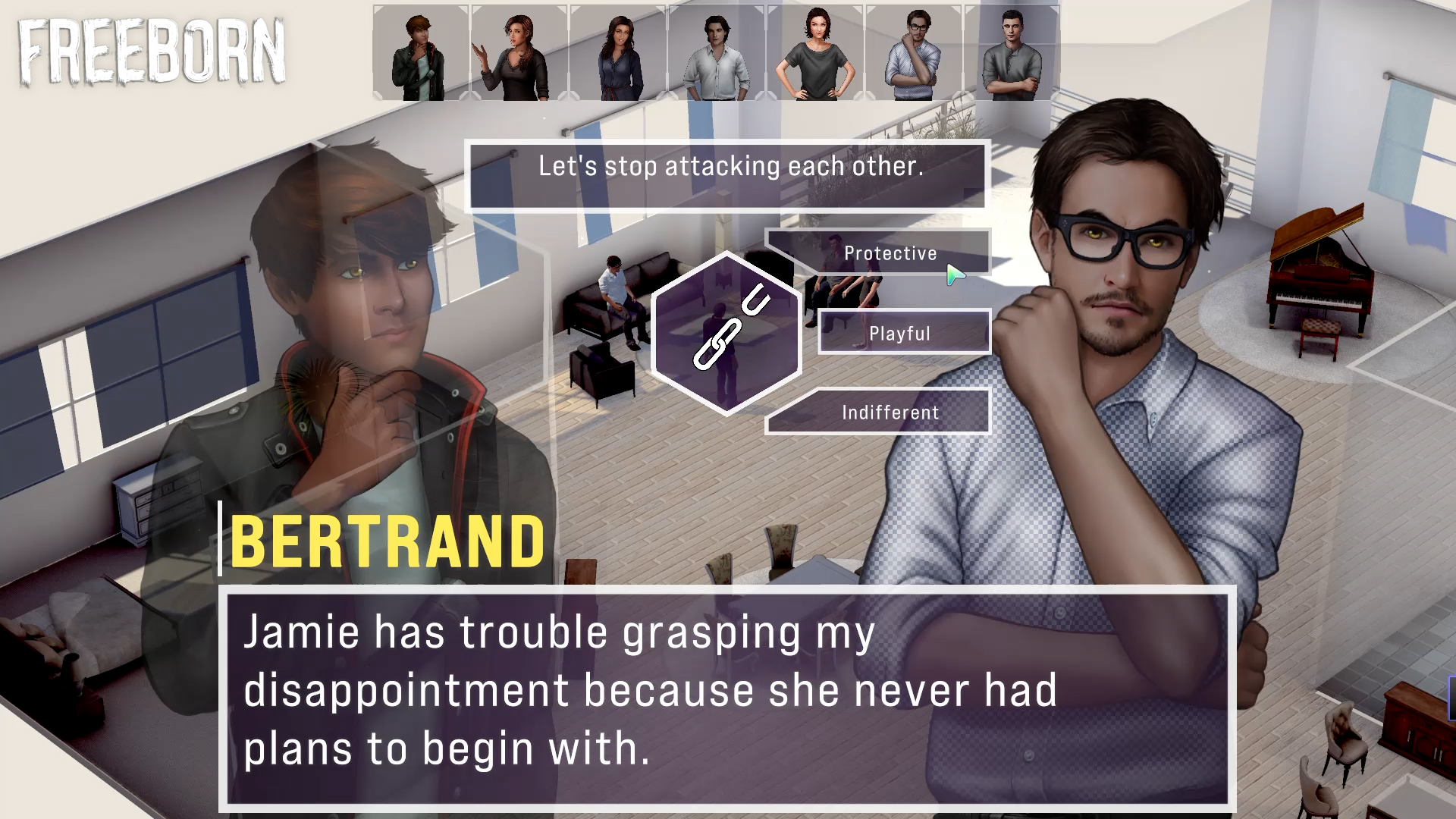
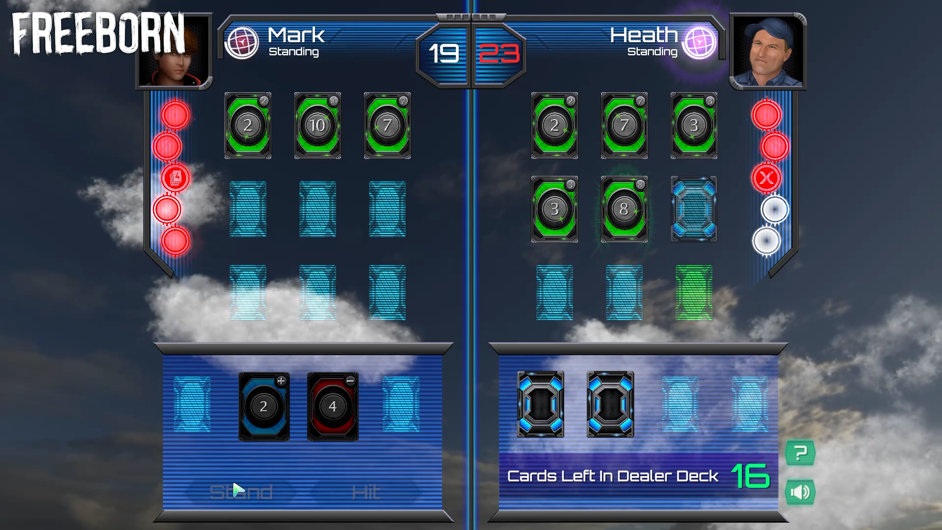

Our main goal is to bring these separate systems into a unified design logic, with a consistent aesthetic no matter where you are in the gameplay loop. We’re aiming for a minimal UI since we love our art and overworld and want to let them take center stage!
We’re excited to show you that work as it comes along. Until then, thanks for reading! The next devlog is going to be #69, which is of course a special occasion. We’ll do you proud.
With love,
Deckpoint Studio
Get Freeborn
Freeborn
Freeborn is a visual novel adventure about messy old friendships, card battles, and psychological chaos. #ChoicesMatter
| Status | In development |
| Author | Deckpoint Studio |
| Genre | Visual Novel, Adventure, Card Game |
| Tags | 3D, Meaningful Choices, Multiple Endings, Singleplayer, Story Rich |
| Languages | English |
| Accessibility | One button |
More posts
- Dev Diary #74: Love is in the Air TonightMar 12, 2024
- Dev Diary #73: Maximum Razzle and DazzleFeb 03, 2024
- Dev Diary #72: The Results of Updating 100K Lines of CodeDec 06, 2023
- Dev Diary #71: Huge Engine Update, Ohayocon and BeyondOct 31, 2023
- Dev Diary #69: Giving and ReceivingAug 16, 2022
- Dev Diary #67: Springing AheadMay 10, 2022
- Dev Diary #66: Luckless Seven is now FreebornApr 21, 2022
- Dev Diary #64: Clear Skies AheadJun 21, 2021
- Dev Diary #63: Warming UpApr 01, 2021


Leave a comment
Log in with itch.io to leave a comment.