Dev Diary #73: Maximum Razzle and Dazzle
Hey folks,
Hope everyone is having a fantastic start to their New Year. As with most of you, the holiday season has been extremely busy for us. In the spirit of sharing, we have a preview of the new UI and visual effects we have created for the Ekosi battle board.
As part of our complete overhaul of the game during our engine update, most of the focus initially was on fixing core systems that got broken (or completely replacing them) and working on the overworld environments. However, it’s been a while since we’ve done a full upgrade of the Ekosi board. We’ve recently completed rework on every element of the board and updated the visual effects that occur at the conclusion of rounds.
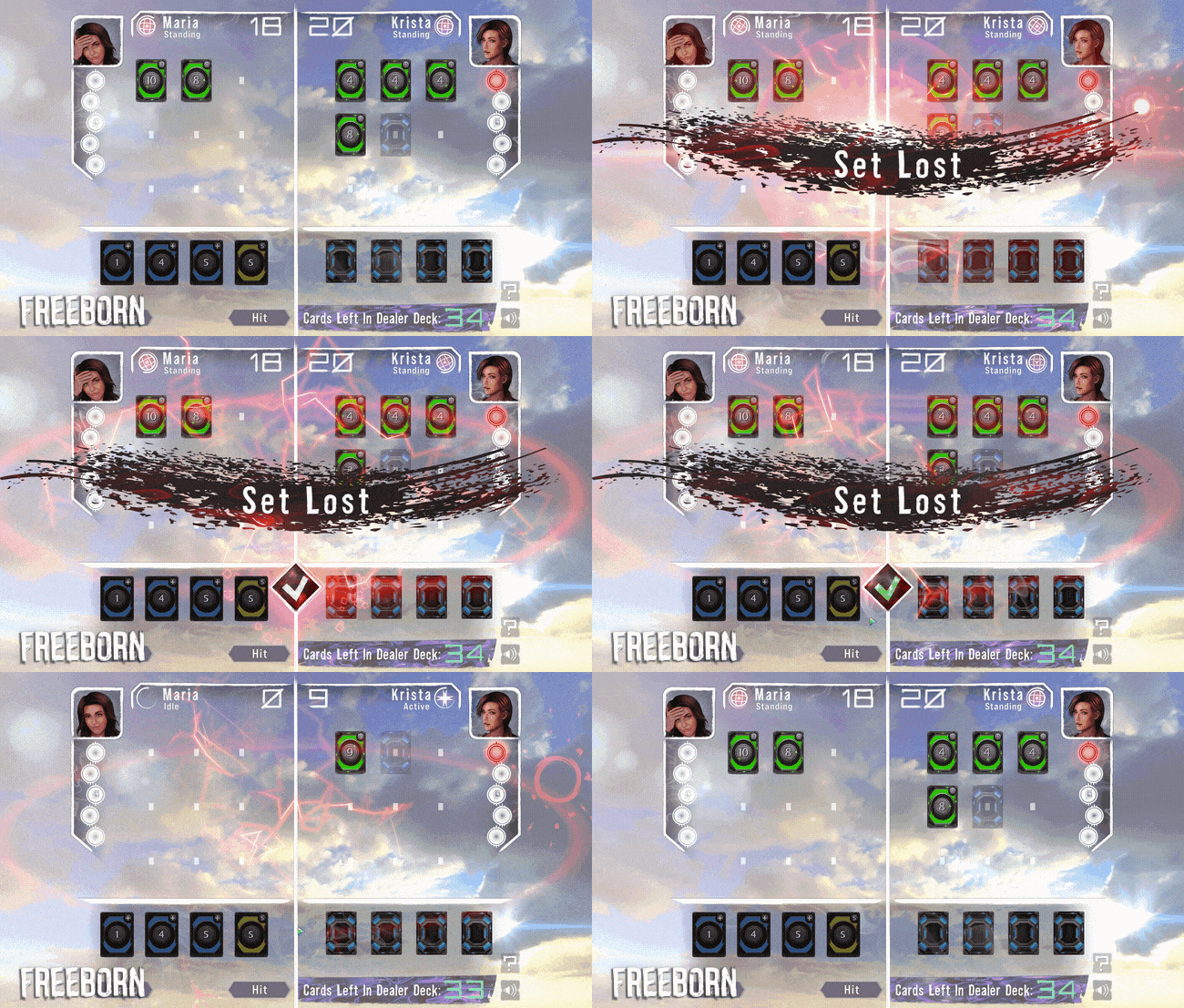
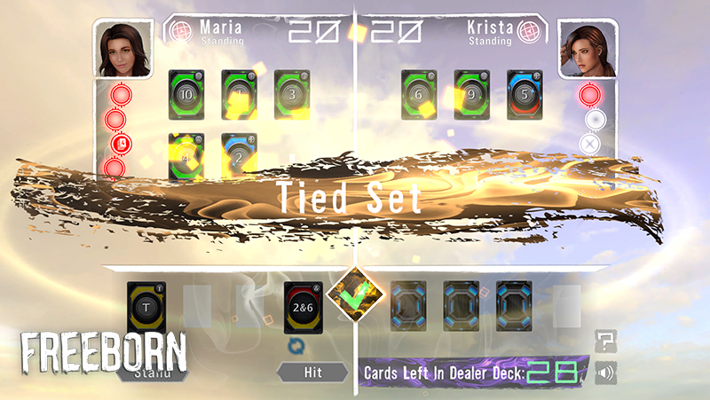
As you can see, we’ve completely changed the main dividers separating the different elements of the board. We felt that the white boards offered a much cleaner separation between sections. Besides making the board look more visually attractive, we looked at ways to make each part of it easier to distinguish. A wavy effect was added to the bottom of the board to make the player hand area more visually distinct from the main battle field.
If you are a veteran player of Ekosi, you may notice that we’ve also replaced the font we were using for all our text, created in-house by our very own Tyler!
We’ve also added completely new particle effects for when the player wins, ties, or loses a round.
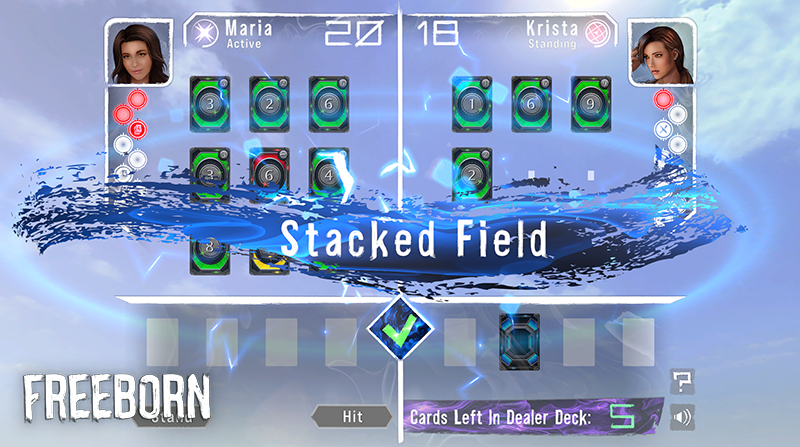
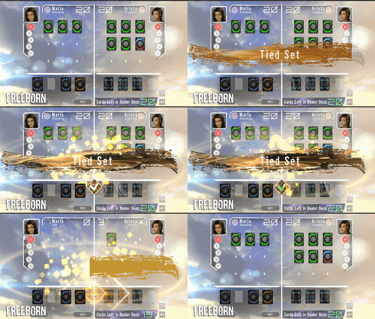
This update to the UI was a long time coming because our previous UI did not support 4k resolution or ultra wide screens. With our update almost complete, Ekosi will be ready to shine on all modern setups!
Our next demo release should have these new UI features implemented, though there are a couple additional reworks that need to be completed first. We will preview those changes in the next update. We also have a completely new gameplay component that will change the nature of the player’s journey. We can’t wait to show you it, but we can’t spoil it yet. For now, let’s just say it will drastically spice up the social dynamic of the game.
Until next time!
Get Freeborn
Freeborn
Freeborn is a visual novel adventure about messy old friendships, card battles, and psychological chaos. #ChoicesMatter
| Status | In development |
| Author | Deckpoint Studio |
| Genre | Visual Novel, Adventure, Card Game |
| Tags | 3D, Meaningful Choices, Multiple Endings, Singleplayer, Story Rich |
| Languages | English |
| Accessibility | One button |
More posts
- Dev Diary #74: Love is in the Air TonightMar 12, 2024
- Dev Diary #72: The Results of Updating 100K Lines of CodeDec 06, 2023
- Dev Diary #71: Huge Engine Update, Ohayocon and BeyondOct 31, 2023
- Dev Diary #69: Giving and ReceivingAug 16, 2022
- Dev Diary #68: Level Design Done, UI Refresh In ProgressJul 02, 2022
- Dev Diary #67: Springing AheadMay 10, 2022
- Dev Diary #66: Luckless Seven is now FreebornApr 21, 2022
- Dev Diary #64: Clear Skies AheadJun 21, 2021
- Dev Diary #63: Warming UpApr 01, 2021
Leave a comment
Log in with itch.io to leave a comment.